Book Notes, April–May 2021
Wayne writes: Not in any particular order, here are books I read during April and May (and an extra):
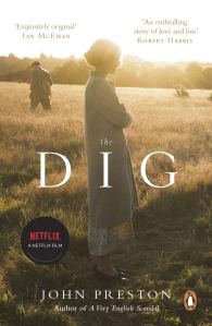
 The Dig by John Preston. Penguin Books, 2021 (first published 2007). A fictionalized account of the discovery and excavation of the Sutton Hoo ship-burial treasure. ‘Certain changes have been made for dramatic effect’: indeed, yes. Preston is entertaining, but fortunately we have some good books on the actual events, which involved many more people and multiple dig seasons.
Fearless by Allen Stroud. Flame Tree Press, 2020. This seemed from descriptions as if it might be a good science-fiction novel about a sort of Coast Guard-rescue ship in space. Not quite. It’s ‘woke’ in a forced way, it’s told awkwardly from multiple points of view and in ‘real time’ (a character telling the story in one chapter turns up dead in the next), the physics of the action are questionable, and the novel ends without a resolution – so, the start of a series, but I won’t be returning.
E. McKnight Kauffer: The Artist in Advertising, edited by Caitlin Condell and Emily M. Orr. Rizzoli/Electa and Cooper Hewitt, 2020. Kauffer was an American graphic artist (1890–1954), a pioneer of the Modernist poster and dust-jacket. This new biography, by multiple authors, is a good example of how to make a book uncomfortable for the reader. The main type is sans serif, none too large and with enormous indents, shoulder notes are in a tiny (six point?) typewriter-style face and in red, and captions are also tiny, in a light roman font, and difficult to relate to the pictures. The text shifts here and there on the page, out of alignment, as do the illustrations, which are not always as sharp as they might be. The book’s designer, who explains at length in a sort of manifesto, chose to reflect Kauffer’s personal contradictions and ‘varied nature’; each spread is ‘its own composition and . . . part of the overall gestalt’. Sorry, no, not over nearly 300 pages. Prefer Mark Haworth-Booth’s E. McKnight Kauffer: A Designer and His Public (2nd ed. 2005).
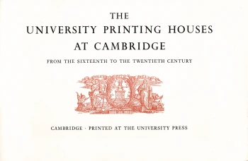
 The University Printing Houses at Cambridge from the Sixteenth to the Twentieth Century by Brooke Crutchley. Cambridge University Press, 1962. This is one of the series of short Christmas books issued by the University Printer in Cambridge for many years. I had long admired the Chapin Library’s copy – elegantly printed in an oblong format, bound in a lovely rust-colored cloth, and housed in a marbled-paper slipcase – and when a chance came along recently to buy one for myself at a discounted price, I leaped at it. Now if I could find, also at a good price, the 1961 Cambridge Christmas book, Bridges on the Backs, with lift-the-flap illustrations by David Gentleman, I would be even happier.
Arts and Crafts Pioneers: The Hobby Horse Men and Their Century Guild by Stuart Evans and Jean Liddiard. Lund Humphries, 2021. A good, if overly long, account of a different side of British art and design, and (especially from my point of interest) book production, in the late nineteenth century, concurrent with and following on the work of William Morris. Well illustrated in a tall format.
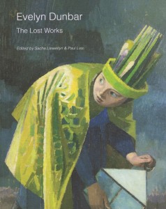
 Evelyn Dunbar (1906–1960): The Lost Works, edited by Sacha Llewellyn and Paul Liss. Liss Llewellyn Fine Art and Pallant House Gallery, 2015. Dunbar is best known for her Second World War paintings of Land Girls and other scenes from the home front, but like so many other British artists of the period, she had a varied output including murals and book illustration. The ‘lost works’ of the title refers to a cache of Dunbar art set aside at her early death and forgotten, though in family hands, for a generation. Dunbar’s biography is more fully presented in Gill Clarke’s excellent Evelyn Dunbar: War and Country (2006), and more recently in Evelyn Dunbar: A Life in Painting (2016) by the artist’s nephew, Christopher Campbell-Howes, which I have yet to read.
Time for Tea by Tom Parker Bowles. 4th Estate, 2021. The latest publication from Fortnum & Mason, London grocers and tea merchants (since 1707). Much more than everything you ever wanted to know about tea, and a blessing to anyone wanting to be a tea connoisseur: where tea is grown, how it’s grown, what kind of tea (so many kinds) one should choose to fit a mood or occasion, much more sophisticated than my Darjeeling if I can get it, but English Breakfast in a pinch (and for breakfast, with lots of milk and one sugar), and Orange Pekoe for iced tea. Plus recipes for scones, etc. I have a fondness for Fortnum’s, and very much regret that they gave up (due to the pandemic) their gallery restaurant in the Piccadilly store as well as their satellite café at St Pancras.
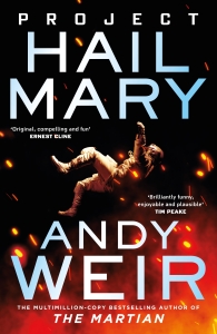
 Project Hail Mary by Andy Weir. Del Rey, 2021. I enjoyed The Martian, but skipped Weir’s Artemis as it had terrible reviews and features a wisecracking petty criminal, which I didn’t think would appeal to me. One review of Project Hail Mary noted that Weir now returns to his hero ‘sciencing’ his way out of many, many problems, which was enough to convince me to order an autographed copy from Blackwell’s (and I liked the U.K. dust-jacket better than the American one, and Blackwell’s pack so beautifully). Science, indeed, to the extent that having some math and physics and biology background is definitely a plus for reading this book. Anyway: hey, I read a best-seller! It’s not often that my tastes align with the mainstream. Although I did read another best-seller recently, which I forgot to put into my January notes:
Ready Player Two by Ernest Cline. Ballantine Books, 2020. I read Ready Player One not all that many years ago, enjoyed it, and like other readers never thought that it needed a sequel. After reading Ready Player Two, my opinion hasn’t changed. Characters who were sympathetic in the first book are here acting like jerks, and if they have only a limited time to save the world (another quest!), why do they sometimes act as if they aren’t on the clock? To be fair, I also enjoyed Ready Player One more than the sequel probably because I was more familiar with the pop culture Cline used in the first book, compared with what Wade and his friends deal with in Ready Player Two, except for one chapter set in the world of The Silmarillion. I’m hopeless with the music of Prince, and with most of the films of John Hughes.
Comments are closed.

At the risk of veering off-topic: do you happen to know what kind of tea Tolkien liked/drank? I have been trying to research what tea the Barrow tearoom offered and have had no luck so far.
Sorry, we don’t know. During wartime, at least, it was probably whatever he could get.
Haven’t read The Dig, but did see the recent film adaptation of it. Do agree that the story is very entertaining. I did not at all care for the fictional romantic relationship involving Peggy Piggot. Also, she was a more experienced archeologist than presented in the film. Not sure why she was portrayed so poorly in the film. She was an exceptionally knowledgeable person who also lived a very interesting life. In her later years she took care of and lived with A.W. Lawrence.
I have read the book, but have not seen the film. I have, however, seen enough clips to know what you mean about how it portrays Peggy Piggot. A long part of the book is told from her point of view, and although there may be some stirrings in the fictional context, there’s no romance. The author, John Preston, treats Peggy with respect, naturally, as she was his aunt (born Cecily Margaret Preston). – Wayne
It is good to hear that the portrayal of Peggy Piggot is more respectful than inf the film. Thanks for that information!
Dear Wayne and Christina, about the two possible errors in LOTR, today I checked 1969, 1991 and 1994 Houghton Mifflin edition, they are all there.
Also I noted another possible tiny error in _Reader’s Companion_(2014). In p. 523 last paragraph, it says:
770 (III: 43). Forlong the Fat, the Lord of Lossarnach – In Appendix F it is said that Forlong was a name ‘of forgotten origin, and descended doubtless from days before the ships of the Numenóreans sailed the Sea’ (p. 1129, III: 407).
However, in both copies of the 50th anniversary edition that I checked, it says “from the days” instead of “from days”. It seems to be a change made in the 1994 edition.
Ah just notice my first comment was unfortunately caught by the spam filter, so I’d post it again without the hyperlinks:
Dear Wayne and Christina, sorry for the off-topic comment, but I don’t know how to contact you in other ways.
I just finished your _Reader’s Companion_, have to say I love it so much, thanks for the fabulous work!
And I noticed your online addenda and corrigenda for _Companion_ and the 50th anniversary edition of _The Lord of the Rings_. So here I will provide some tidbits that I think might be under consideration for the addenda and corrigenda.
—LOTR 50th anniversary edition—
I find two issues that haven’t been listed in your corrigenda. And they also appeared in 1969, 1991 and 1994 Houghton Mifflin editions.
In Appendix A, the drawf family tree, the line between Durin the Deathless and Durin VI should be a dashed line, hinting there are generations in between, just as the line between Thorin III and Durin VII. In Tolkien’s earliest drawf family tree, he also used a dashed line in both cases. (_The Peoples of Middle-earth_, p. 277)
In Appendix E II (i), a note says “The only relation in our alphabet that would have appeared intelligible to the Eldar is that between P and B; and their separation from one another, and from F, M, V, would have seemed to them absurd.” P and B being together in a “English Tengwar” would make sense, but why would P, B, F, M, V be put together? That makes no sense. Here the last sentence should be “and FORM F, M, V, would have seemed to them absurd”. P and B have similar forms in their alphabet, whereas F, M, V don’t.
—Companion 2014 edition—
p. 83, third paragraph: “Allen & Unwin replaced the block with the version subsequently printed in all editions except the fiftieth anniversary edition of 2004: there the earlier, rejected lettering was reproduced by mistake”. When I first read this sentence, I thought all the versions based on the text of fiftieth anniversary edition, including the one in my hand, got the ring inscription wrong. So I spent quite a while searching online for the “correct” version. Finally I noticed, according to your “Lord of the Rings Comparison 2”, only two editions in 2004 and 2005 got the ring inscription wrong. So I think the sentence is a little misleading, maybe add something like “The mistake has been corrected in later prints” would be better.
p. 468, last paragraph: “Boromir’s death occurred at about noon on 26 February, but this conversation is taking place in late afternoon. The call of Boromir’s horn took time to reach Faramir to the south, if sound it was, and not a supernatural ‘echo in the mind’.” According to the map it is approximately 180 miles between Boromir and Faramir. The speed of sound in air is about 770 mph. So it would take only about 15 minutes for Faramir to hear the horn. This is either a synchronization mistake, or supernatural ‘echo in the mind’, or some magic on sound.
p. 480, tenth paragraph: “white locks – Snow-covered peaks. ” It might be worthwhile to point out Mindolluin means “Towering blue-head” (p. 439, note on Mindolluin), hence her peak is described as “locks”.
p. 548, ll. 15-16: For “Book VI, Chapter 7” read “Book V, Chapter 7”.
p. 620. It might be useful to add a note here on “Towers fell and mountains slid…And then at last over the miles between there came a rumble, rising to a deafening crash and roar;” It is 30 miles by raven from Barad-dûr to Mount Doom, which means the sound needs a little more than 2 minutes to reach Mount Doom.
p. 632, fifth paragraph: “argent – Silvery white.” Since it is used to describe the Steward’s heraldry, I think it is worthwhile to point out here argent is the heraldic term for the silver color.
p. 633, last paragraph. This paragraph seems to be misplaced. It should be the note for later text.
p. 729, second paragraph. Åke Jönsson’s conclusion, that Tolkien calculated the 8 hours deficit correctly, is apparently wrong. So Jönsson’s conclusion is better not mentioned here, to avoid confusion.
I realize the second “issue” of LOTR is in fact my mistake (blush). Tolkien didn’t refer to their look, but to the pronunciation.